Sunday, 27 November 2011

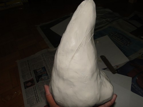
DINOSAUR TEETH (Tyrannosaurus rex) - 8 1/2 Inches

Meet the business end of “Jimmy”
"The largest Tyrannosaurus Rex ever discovered"

Tyrannosaurus rex has become the most widely recognized dinosaur species in popular culture. This winter the Royal Ontario Museum has added to our renowned collection of dinosaur skeletons, with a new discovery. ‘Jimmy’ the nick name for the largest known Tyrannosaurus rex will join our dinosaur gallery along with fascinating fossil birds, mammals, insects and plants of the Jurassic and Cretaceous periods.


"Tyrannosaurids had a large, powerful skull and jaws.  The design of the skull bones enabled it to absorb great stress without damage.  The large curved teeth were serrated and thicker than other typical therapod teeth of laterally compressed design.  This enabled the teeth of tyrannosaurs to puncture thick hide and tendons, crush bone with ease and hold up under the extreme bite force of the jaw muscles."
http://www.paleodirect.com/tyrannosaurus1.htm

Wednesday, 23 November 2011

DMA 188 ‐ LAB ASSIGNMENT

5 different kinds of Social media venues that I'm part of:

1. Facebook
2. Hotmail
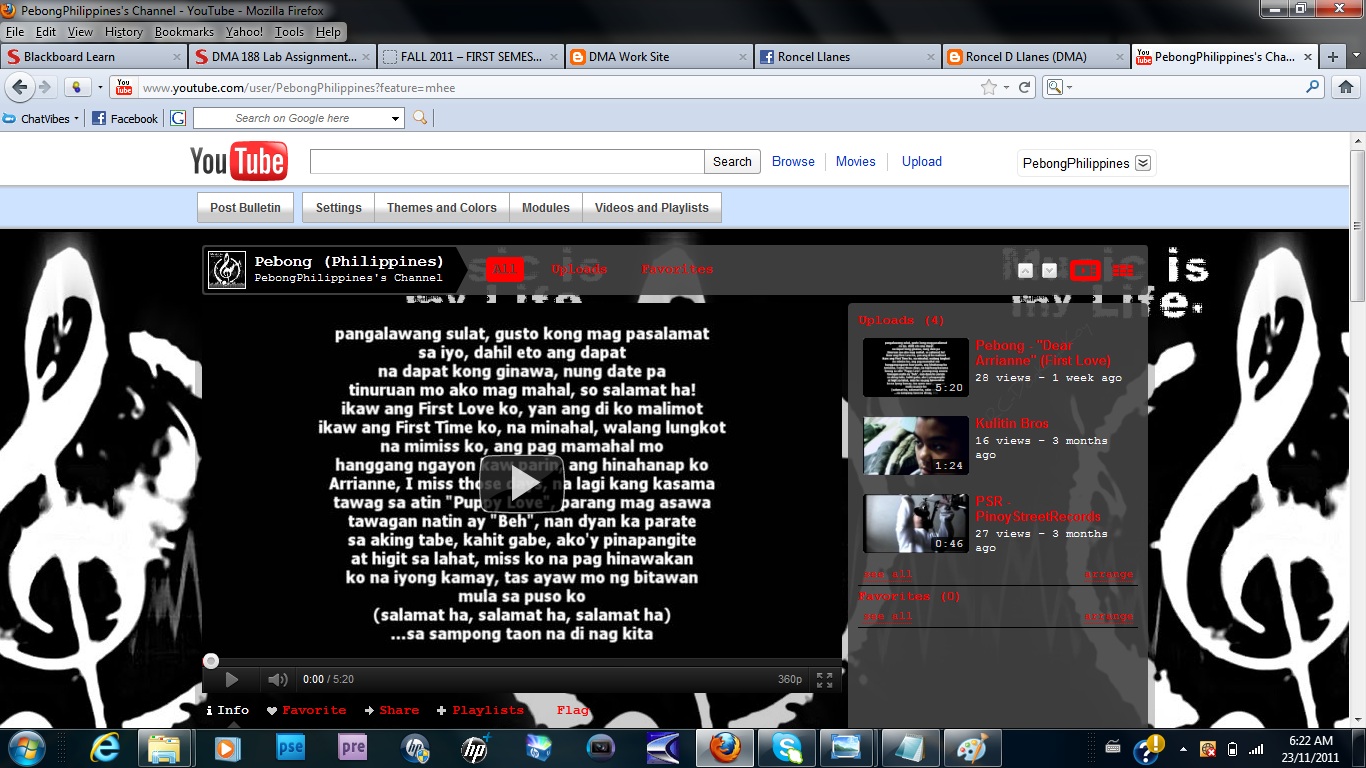
3. YouTube
4. Sound-click
5. Blog-spot

List the number of contacts you have on each social media venue:
Facebook: 400 - (Friends, Relatives, Fans, and more)
Hotmail: 50 - (People that I share my work with)
YouTube: 30 - (I have few subscribers the likes to watch my music videos)
Sound-click: 300 - (Rappers, Singers, Beat makers, & more that I collaborate with to make Music)
Blog-spot: 0 - (I do have some friends that likes to visit my site, but they doesn't have a blog-spot account )

List the amount of time you spend on each social media venue broken down by day and/or week:
Facebook: 24/7 ( By being online on BlackBerry)
Hotmail: 15 Minutes per day, or 4 Hours in a Week
YouTube: 3 Hours per day, or 20 Hours in a Week
Sound-click: 3 Hours per day, or 20 Hours in a Week
Blog-spot: 40 Minutes per day, or 5 Hours in a Week

List the different types of content you upload on each venue:
Facebook: Family/Friends Pictures, Music Videos, Funny quotes
Hotmail: Resume, School work, Projects
YouTube: Music Videos, Tutorials
Sound-click: Tagalog and English Music, Page cover, Pictures, Logos
Blog-spot: All Digital Media Art Work

List the social media venues you declined to be a part of and why:
Friendster - Multiply - especially MySpace
They are not that interesting anymore, by not being updated such as Facebook.
Also, MySpace has begun modifying its policies--for example, limiting adults' ability to contact minors. That's hardly enough. Requiring some kind of authentication from MySpacers--or their parents--to validate their ages and identities would go a long way toward scaring off the creeps and making the site a kinder, gentler social network. MySpace is a headache we don't need.
Facebook is SO much better than MySpace! There's no fee. It's also clutter-free, unlike myspace (although it's starting to change with all the applications people are coming up with!). 

*List the one Social Media venue you use the most and why:
Facebook, it's a great way of getting in touch with old friends as well keeping in contact with your current friends, family and colleagues. I'd say it was hugely better than Myspace in almost every way.
It helps me to connect with my friends by chatting, updating profiles,  and showing interesting stuff by uploading pictures.

Write a paragraph on why or why not Social media play a prominent role in your day to day life:
Social media is mostly about social networking, I believe it does and should still play a prominent role in our day to day life because it is very helpful to people. For example, it is the best way for one person to meet up with other people on the Net. That's not all though. Some people use social networking sites for meeting new friends on the Net. Others use it to find old friends. Then there are those who use it to find people who have the same problems or interests they have.

Tuesday, 22 November 2011

User Interface Principles of Design

The Structure Principle:
We have to structure our product or service to understand quickly. It is very important thing to fulfill our customer/visitor to find information easily. The design should be organized in a meaningful and useful ways. The important or related things should be placed together and separate unrelated things, also needs to have enough information for the customers to make a decision. 

Three Design Techniques are:
  • Word your messages and labels effectively
  • Align fields effectively 
  • Group things effectively 

Photoshop’s toolbar is an excellent example for the “Structure Principle”, because the toolbar was organized well with the similarity groups. The toolbar also has the related tools together for meaningful and useful purposes.

The Simplicity Principle:
The design has to be simple and common. The principle communicates clearly in the user’s common language. Use shortcuts and hotkeys for the important procedures, so it is very easy and comfortable to use in an emergency.

Three Design Techniques are:
  •  Consistency
  • Set standards
  •   Understand the UI widgets

These kind of old mobile phones are still useable for its simplicity. Some users like to use these because it is designed for a simple and common use. They used hotkeys for the important procedures, for example the green button for calling and the red button to exit/end.

The Visibility Principle:
The visibility is all about the clearly the user see. The options and Icons should be visible to the users to use. Too much options and buttons are confusing the users and it is not structured well for the user interface.
 
Three Design Techniques are:
  • Don’t create busy user interfaces
  • Navigation within a screen is important
  • Align fields effectively

An ATM machine is a great example for the “Visibility Principle”. It doesn’t have too many options to confuse the users. The ATM machine clearly designed for users to use it easily, they have each section with pictures and text. For example: a card icon used to let the user know where to insert the card and same idea for the cash and envelop sections, so it is visually an easy way to do.

The Feedback Principle:
The feedback in user interface needs to be work with user’s actions. For the users action the feedback principle should react. It has to inform the result of the user’s actions.

Three Design Techniques are:
  • Understand the UI widgets
  • Word your messages and labels effectively 
  •   Explain the rules
 
We set alarms on alarm clock to wake-up in the morning and it does rings on time that we want it to be. It gives us the feedback/result for our actions and it is also informing the result by ringing the alarm on time.

The Tolerance Principle:
It should be flexible, and designed to reduce the number of user errors. Also make easier ways to recovery from the errors and mistakes.

Three Design Techniques are:
  • Expect your users to make mistakes
  • Your design should be intuitable
  • Explain the rules

When we type in Microsoft Word we notice our spelling mistakes with a red underline and a green underline for our grammar errors. We can correct our mistakes by right clicking on the wrong word and select the right one, also we can use a tool called “spelling & grammar” to change our mistakes. It is a great example for the “tolerance Principle”.

The Reuse Principle:
The concept should be reused, and its behaviors are the same. Consistency used with a purpose and function not just for a visual concept, and try to eliminate the need for users to rethink and remember.

Three Design Techniques are:
  • Consistency
  •   Set standards
  •    Understand the UI widgets
We all know the reaction of red “X” button on the top right corner of windows applications. We can also see the same concept reused on some other devices and it does the same behaviors.

Sunday, 20 November 2011

Character Illustration (Fire Antz Logo)


This is my logo (REF), my first step was to Dim the image to %50.

2nd step, I made the background in black, it took me about 15 minutes.

3rd  step, I made the red text of  "Fire Antz", it took me around 45 minutes.
It was a bit challenging for me, because I was still practicing of using the Anchor Point Tool.

4th step, I didn't use the pen for this, I just copy and paste the "Fire Antz" in red.
I re-size it until I get the exact size for the white text, fixed some points to make it perfect,
then I changed the color font to white. This took me about 30 minutes.

Then I added the wholes between the "I" and "R", and the "A".

5th step, was the most challenging part,  creating the "FAYETTEVILLE".
I wish I could've just use the Text tool to make it, but I still had to use the Anchor point to copy the exact (style, size, position) font. This took around me 30 minutes.

6th step, I made the Ant in Red with the hockey stick.
This time, I was having a good time making it
because I didn't struggle anymore of using the Tools, I was getting use to it.
This took me about 45 minutes.

Finally, I made the shiny (white) part of the Red Ant, eyes, gloves, and the Hockey stick.
This took me about 30 minutes. 

It was a pretty fun project!!!

Photography Product Shot

MDA MindMap